Start with What You Love
Your home should reflect what already speaks to you. Start simple: open your closet. What colors show up again and again? That navy sweater, the soft olive coat, the burnt orange scarf these choices weren’t random. They’re clues. You’re already drawn to certain tones, so let them guide you.
Go beyond your wardrobe. Flip through your favorite coffee table books. Look at the pieces of art that haven’t moved in years. Notice the colors in that photo you took on a coastal hike or the ceramic mug you use every morning. These are sources, not just stuff.
Now, gather. Swatches of fabric. Paint strips. Photographs. Magazine clippings. Build a mood board digital or physical. Don’t overthink it. It’s about trusting your eye and seeing patterns emerge. What you’re doing is curating, not decorating.
Once your board starts to take shape, choose a dominant base tone. This will ground your palette it could be a warm neutral, a moody charcoal, or even a pale sage. Add two or three supporting colors that complement it. These aren’t accents yet they’re the rest of your visual vocabulary. Together, they’ll give your space structure, clarity, and rhythm.
Understand How Light Changes Color
Light is one of the sneakiest influences on color and one of the most overlooked. Natural light shifts throughout the day. Artificial light varies by bulb type. Both can make a gray look blue, or a warm beige seem dull. If you’re trying to lock down a palette that feels right, this matters.
South facing rooms tend to bathe your walls in warm, golden light. This can make warm tones feel even toastier, and it often flatters reds, yellows, and earth tones. North facing rooms, on the other hand, pull cooler. Whites might look icy, and soft blues or greens can turn sharper. Direction matters learn it before committing.
Don’t just fall in love with a color at the paint store. Get samples. Put them on different walls. Check them morning, midday, evening. Light isn’t static, so your color choice shouldn’t be rushed. What pops at noon may fall flat at dusk.
For a deeper breakdown, check out Essential Lighting Tips to Brighten Every Room.
Define a Flow Through Palette
Creating a cohesive color palette goes beyond choosing a few pretty shades it’s about guiding the eye naturally from room to room. A well designed flow through palette ties your home together, making it feel intentional and harmonious.
Start with Undertones
The first step to achieving consistency is understanding undertones. Every color, even neutrals, has a warm or cool undertone.
Warm undertones: think beige, cream, terracotta, or golden hues
Cool undertones: look for grays, icy blues, or crisp whites
Pick one undertone direction and carry it throughout your spaces. Mixing warm and cool without a plan can make a home feel disjointed.
Anchor with Neutrals
Neutral shades form the backbone of a whole home palette. They let your accent colors shine and can pull together otherwise contrasting rooms.
Choose one or two go to neutrals: white, gray, greige, or soft taupe
Use neutrals on major surfaces walls, ceilings, or flooring
Repeat them through different textures to maintain interest
Create Subtle Connections Between Spaces
Even if each room has a distinct vibe, the palette should flow smoothly from one area to the next. This doesn’t mean using the exact same colors, but rather finding ways to link the palette across the home.
Echo a shade from one room in the artwork or textiles of another
Transition tones gradually for example, a soft clay hue in the living room can lead into a blush tone in a bedroom
Use rugs, throws, or upholstery to reinforce color continuity throughout your space
Establishing these gentle connections builds visual rhythm and helps your home feel balanced, unified, and inviting.
Apply the 60 30 10 Rule
This tried and true formula works because it’s simple and effective. It keeps your space visually balanced without overthinking every corner. Here’s how it breaks down:
60% of the room should be your dominant color. This usually goes on the walls, big furniture pieces, or floors think of it as the canvas everything else builds on.
30% is your secondary shade. This is where you bring in contrast and personality upholstered chairs, area rugs, curtains, maybe a statement piece of furniture. It supports the main color but still has enough room to add interest.
10% is for the accents. Art, throw pillows, lamps, vases small details that pop and give the space that extra edge. This is your chance to be bold without overwhelming the room.
When used properly, this ratio makes your design feel intentional. It keeps the eye moving. And most importantly, it prevents color overload. In short: structure brings freedom.
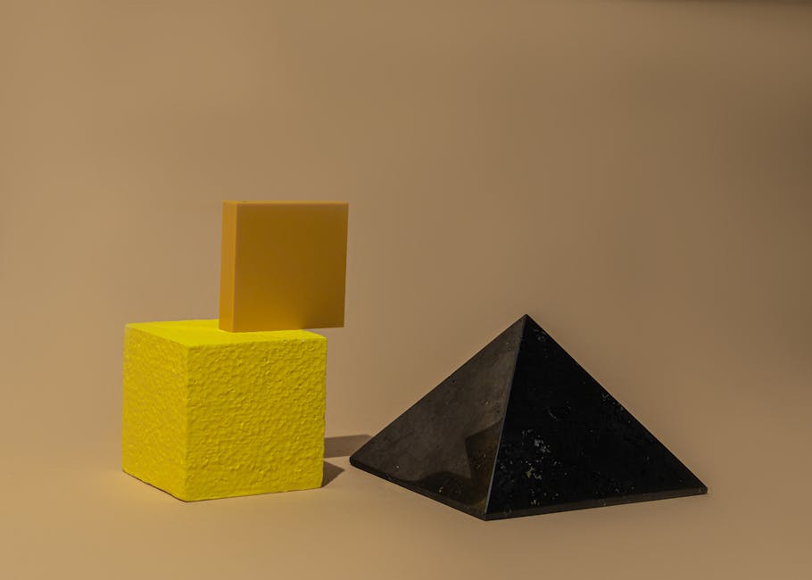
Use Texture for Dimension
Color sets the mood, but texture is what gives a space life. When you’re working within a tight palette especially monochrome variation comes from how things feel, not just how they look. Mixing matte, gloss, and metallic finishes in the same shade range instantly adds layers. Imagine a flat wall, glossy tiles, and a brushed metal lamp all in charcoal gray. Same color, completely different energy.
Textiles are your secret weapon. A wool throw, linen curtains, a velvet cushion these simple combinations create a tactile richness that pulls people in. They don’t just see the room, they experience it.
So if your scheme sticks to a single color family, don’t worry about boredom. The trick is choosing the right mix of materials. Smooth against rough. Soft against reflective. It’s in those contrasts that a room starts to feel alive.
Adjust for Function and Mood
A room’s purpose should guide its palette. In spaces meant for rest bedrooms, bathrooms stick with calm tones. Soft blues, pale teals, and dusty greens help quiet the mind and drop the tempo. Minimal contrast, minimal overload.
Now, flip the switch for places that thrive on energy. Kitchens, studios, home offices they benefit from warmth and punch. Terracotta, ochre, a smart navy these shades bring focus and a bit of fire without crowding the senses.
Then there are your multi use zones the living rooms and open plan areas where your day blurs from coffee to couch to calls. Here, earthy and muted works best. Taupes, soft browns, olive tones. Grounding without being dull, flexible enough to take on the day or hand it off. The aim: balance energy and ease, without overthinking the effect.
Final Check: Test Before You Commit
Color looks different in every room and under every light. That sample you loved in the store may feel totally off under your living room’s daylight or your bedroom’s soft lamp glow. Always test paint directly on the wall, in the room where you’ll live with it. Aim for a spot that gets both natural and artificial light, and check it at different times of day.
Don’t rush the decision. Live with the sample for a few days. What sings to you at 9 a.m. might fall flat by dusk. Let it settle. Trust your eyes. Let the color breathe.
Lastly, remember that a good palette shouldn’t fight for attention. It should steady the space. Think quiet cohesion over flashy statements. You’re not just decorating you’re building an atmosphere that works in the background, not on center stage.
 Ask Emilyn Carrollister how they got into diy projects and ideas and you'll probably get a longer answer than you expected. The short version: Emilyn started doing it, got genuinely hooked, and at some point realized they had accumulated enough hard-won knowledge that it would be a waste not to share it. So they started writing.